Technology
Samsung Revamps App Icons with 3D Design in One UI 8.5
Samsung is set to introduce a significant visual update to its mobile software with the forthcoming One UI 8.5, expected to launch alongside the Galaxy S26 series in early 2026. This update marks a departure from the minimalist aesthetic of its predecessors, opting instead for a more dynamic 3D design for app icons.
One of the most notable changes involves a shift away from the flat, two-dimensional appearance that has characterized recent One UI versions. Internal builds of One UI 8.5 indicate that app icons will feature a three-dimensional look, incorporating subtle shadows, smooth curves, and highlights. This design approach aims to provide a more realistic, raised appearance on the device screen.
Emphasizing Depth in User Experience
The introduction of depth into the app icons signifies a broader redesign within One UI 8.5. While maintaining the vibrant gradient colors that users have come to expect, the new icons will include a drop shadow effect. This enhancement creates the illusion that the icons are slightly elevated, akin to physical objects. The redesign will not be limited to Samsung’s default applications; popular third-party apps like YouTube and the Google Play Store will also feature the new icon style. This move is intended to create a unified visual experience across the entire system.
For long-time Samsung users, this 3D aesthetic may evoke nostalgia, reminiscent of the later versions of the TouchWiz interface last seen on devices such as the Galaxy S6. While some critics may view this design choice as a regression, Samsung appears to be aiming for a refined and contemporary look that complements the overall user interface. Notably, this trend towards more dimensional icons aligns with similar design experiments in the testing phases of iOS.
Broader UI Enhancements and Performance Considerations
The redesign of app icons is part of a more extensive overhaul within One UI 8.5. Updates to Samsung’s core applications include a new compact, pill-shaped tab bar for bottom navigation. This minimalist adjustment removes the text labels that were part of previous iterations, resulting in a cleaner and less cluttered appearance.
However, this ambitious visual shift brings potential risks. Early reports from users testing leaked builds indicate that the more complex 3D rendering and drop shadows are placing additional demands on the hardware of testing devices. As a result, some users have noted a decline in battery life attributed to these design changes.
With One UI 8.5 still in development, Samsung has the opportunity to optimize both design and performance before its official release. The company aims to strike a balance between aesthetic appeal and functional efficiency as it moves forward with upcoming beta updates.
As Samsung continues to innovate, the changes in One UI 8.5 could significantly influence user experience and set a new standard for mobile software design.

iShares Core Dividend Growth ETF Faces Challenges; Alternatives Suggested

Discover 7 Scenic Hikes Near Calgary to Explore This Spring

Scientists Uncover Life’s Building Blocks in Ryugu Asteroid Samples

Windsor-Essex Unveils New Action Plan to Combat Substance Use

Boost Your Business Visibility with These Local SEO Strategies

East Algoma OPP Urges Public to Limit Travel Amid Hazardous Conditions

Universities Must Rethink Failure to Support Student Growth

Canada Invests $6.4 Million to Boost Green Shipping Corridors

Stony Plain Secures 14th Consecutive Award for Financial Reporting Excellence

Rhythm Pharmaceuticals Reports Strong Q4 Growth Ahead of FDA Decision

Brandon University’s Failed $5 Million Project Sparks Oversight Review

Microsoft Confirms U.S. Law Overrules Canadian Data Sovereignty

Winnipeg Celebrates Culinary Creativity During Le Burger Week 2025

Discover Aritzia’s Latest Fashion Trends: A Comprehensive Review

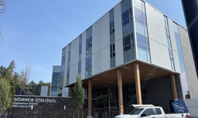
New SĆIȺNEW̱ SṮEȽIṮḴEȽ Elementary Opens in Langford for 2025/2026 Year

EngineAI Unveils T800 Humanoid Robot, Setting New Industry Standards

Montreal’s Groupe Marcelle Leads Canadian Cosmetic Industry Growth
Tech Innovator Amandipp Singh Transforms Hiring for Disabled

Dragon Ball: Sparking! Zero Launching on Switch and Switch 2 This November

Digg Relaunches as Founders Kevin Rose and Alexis Ohanian Join Forces
-
 Education7 months ago
Brandon University’s Failed $5 Million Project Sparks Oversight Review
-
 Science8 months ago
Microsoft Confirms U.S. Law Overrules Canadian Data Sovereignty
-
 Lifestyle7 months ago
Winnipeg Celebrates Culinary Creativity During Le Burger Week 2025
-
 Lifestyle4 months ago
Discover Aritzia’s Latest Fashion Trends: A Comprehensive Review
-
 Education7 months ago
New SĆIȺNEW̱ SṮEȽIṮḴEȽ Elementary Opens in Langford for 2025/2026 Year
-
 Business4 months ago
EngineAI Unveils T800 Humanoid Robot, Setting New Industry Standards
-
 Health8 months ago
Montreal’s Groupe Marcelle Leads Canadian Cosmetic Industry Growth
-

 Science8 months ago
Tech Innovator Amandipp Singh Transforms Hiring for Disabled
-
 Technology8 months ago
Dragon Ball: Sparking! Zero Launching on Switch and Switch 2 This November
-
 Technology3 months ago
Digg Relaunches as Founders Kevin Rose and Alexis Ohanian Join Forces
-

 Lifestyle4 weeks ago
Canmore’s Le Fournil Bakery to Close After 14 Successful Years
-
 Top Stories4 months ago
Canadiens Eye Elias Pettersson: What It Would Cost to Acquire Him
-

 Health7 months ago
Eganville Leader to Close in 2026 After 123 Years of Reporting
-
 Education8 months ago
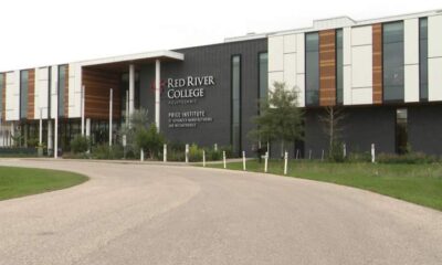
Red River College Launches New Programs to Address Industry Needs
-

 Top Stories4 months ago
Nicol Brothers Shine as Wheat Kings Dominate U18 AAA Hockey
-
 Business8 months ago
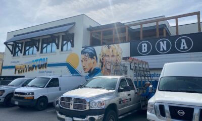
BNA Brewing to Open New Bowling Alley in Downtown Penticton
-

 Business7 months ago
Rocket Lab Reports Strong Q2 2025 Revenue Growth and Future Plans
-

 Education6 months ago
Alberta Petition Aims to Redirect Funds from Private to Public Schools
-

 Lifestyle5 months ago
Edmonton’s Beloved Evolution Wonderlounge Closes, New Era Begins
-

 Education8 months ago
Alberta Teachers’ Strike: Potential Impacts on Students and Families
-

 Technology6 months ago
Discord Faces Serious Security Breach Affecting Millions
-

 Technology8 months ago
Google Pixel 10 Pro Fold Specs Unveiled Ahead of Launch
-

 Business7 months ago
Iconic Golden Lion Restaurant in South Surrey to Close After 50 Years
-

 Science8 months ago
China’s Wukong Spacesuit Sets New Standard for AI in Space